In this article, we'll explore the uses of the CSS gap property, which makes it super easy to add space between elements, and solves a number of layout issues that have plagued developers over the years.
What is gap For?
The gap property allows us to add space between elements horizontally and vertically. We've always been able to do this with margin, of course. But using margin to space items apart can be a pain — especially when items wrap across lines — because there's always that last item that will have unwanted margin.
The following Pen shows four divs spaced apart with right and bottom margin:
article > div {
  margin: 0 10px 10px 0;
}
See the Pen
The CSS gap Property: using margin instead of gap by SitePoint (@SitePoint)
on CodePen.
Notice the background of the container sticking out along the right and across the bottom?
The gap property only puts space between items, which makes it so much easier for layout. Here's the same layout as above, but this time using gap instead of margin:
article {
  display: grid;
  gap: 10px;
}
See the Pen
The CSS gap Property: spacing items with gap shorthand by SitePoint (@SitePoint)
on CodePen.
Now we don't get the ugly, unwanted gap on the right and along the bottom. The gap is now just between items, and the items fit snugly within the their container.
We can use gap with three different layout modes: Grid, Flexbox, and multi-columns. We'll look at each in turn below.
Guidelines for Using the gap Property
Using gap is as simple as writing gap: 10px. (We saw the result of doing that in the demo above.) But let's look at what this means.
The gap property can take two values: a row value (that is, the space between rows of elements), and a column value (the space between columns of elements): gap: <row-gap> <column-gap>.
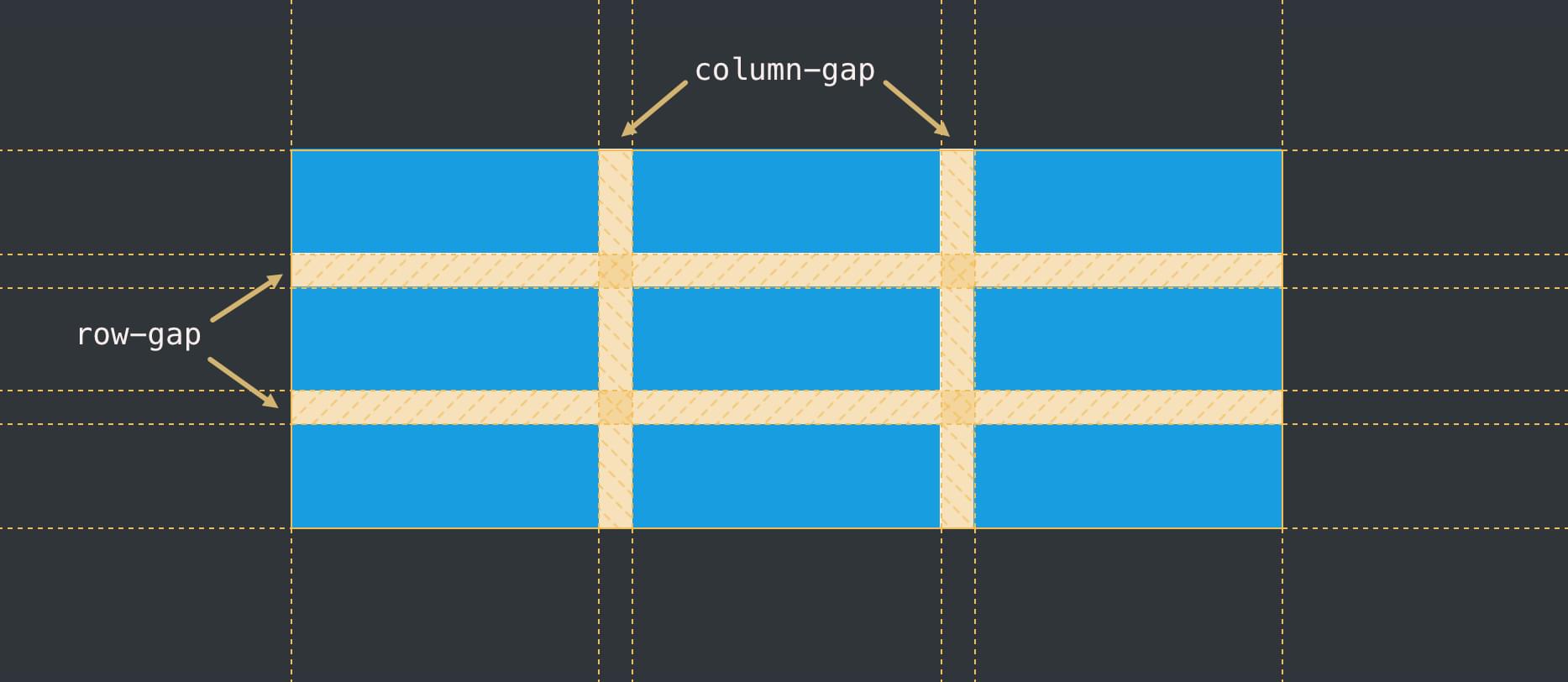
If we specify only one value, it will apply to any rows and columns.
We can just specify a column or row gap separately with the row-gap and column-gap properties.
Values for gap can be any length units (such as px, em, vw), percentage units, or even values calculated with the calc() function.
How to Use the gap Property with CSS Grid
We saw an example above of gap used with Grid layout. Let's try another example with some different units:
article {
  display: grid;
  gap: 30px 1em;
}
See the Pen
The CSS gap Property: using gap with Grid longhand by SitePoint (@SitePoint)
on CodePen.
This time, we have different units for row and column.
An extra bonus of gap is that it works seamlessly across responsive layouts. If we set a gap between two items, that gap will apply whether the items sit side-by-side or one above the other, as shown in the Pen below.
See the Pen
Untitled by SitePoint (@SitePoint)
on CodePen.
Press the 0.5x button at the bottom of the Pen above, or open the Pen in your browser and widen and narrow the viewport to see how the gap direction adjusts to the arrangement of the boxes. We're benefitting here from the single value on the gap property, which can apply to rows and columns. If we don't want the gap between rows on smaller screens, we could instead set column-gap: 10px. Try this in the Pen above.
For more on how to work with Grid layouts, check out our beginner's guide to CSS Grid layout.
The post How to Use the CSS gap Property appeared first on SitePoint.