The CSS Grid Layout Module has revolutionized the way websites are built. It offers tools that allow for advanced layouts without the tricky hacks and inventive solutions of the past.
In this introduction to Grid, we'll walk through the basics of how Grid layout works, and we'll look at lots of simple examples of how to use it in practice.
Getting Started with Grid Layout
A grid is a framework of columns and rows into which we can place content. (It's a bit like a table layout, but on steroids!)
Getting started with Grid is as simple as doing this:
.container {
  display: grid;
}
Now, all of the direct children of the .container element will be "grid items". To start with, they'll just appear as a bunch of rows in a single column, as shown in the demo below.
See the Pen
CSS Grid Basics: display: grid by SitePoint (@SitePoint)
on CodePen.
In the example above, we have a <div> element that acts as the container. Inside it we have several elements, which are now grid items:
<div class="container">
  <header>header</header>
  <aside>aside</aside>
  <main>main</main>
  <footer>footer</footer>
</div>
So far, we haven't achieved much, as we would get the same result without display: grid.
Further reading:
- In the demo above, the container is centered in the viewport. Read more about centering elements with Grid.
Setting a Gap Between Grid Items
Let's first space our divs apart a bit with the gap property:
.container {
  display: grid;
  gap: 10px;
}
See the Pen
CSS Grid Basics: gap by SitePoint (@SitePoint)
on CodePen.
The gap property inserts space between the elements vertically and horizontally, as we'll see shortly. (We can set different horizontal and vertical gaps if we need to.)
Further reading:
- Read more about the gap property.
Setting Up Grid Columns
Currently, we have an "implicit" grid — meaning that the browser is just figuring out a grid for itself, as we haven't specified any rows or columns yet. By default, we just get one column and four rows — one for each grid item. Let's now specify some columns:
.container {
  display: grid;
  gap: 10px;
  grid-template-columns: 1fr 1fr 1fr 1fr;
}
With grid-template-columns, we're specifying that we want four columns each with a width of 1fr, or one fraction of the available space. (Instead of 1fr 1fr 1fr 1fr we could write repeat(4, 1fr) using the very handy repeat() function.)
Now our grid items are laid out in one row, as shown below.
See the Pen
CSS Grid Basics: grid-template-columns by SitePoint (@SitePoint)
on CodePen.
Further reading:
- Further information on grid-template-columns.
- Learn more about the flexible length (fr) unit.
- How to use Grid's repeat() function.
Organizing Grid Items into Rows and Columns
Now let's organize our grid items into rows and columns, as we might see them on a standard web page layout.
Firstly, we'll specify three rows with the grid-template-rows property:
.container {
  display: grid;
  gap: 10px;
  grid-template-columns: 1fr 1fr 1fr 1fr;
  grid-template-rows: auto auto auto;
}
If we add that line to the Pen above, not much will happen yet, as we haven't specified how we want our grid items to fit into these rows and columns. (Again note that auto auto auto could be written as repeat(3, auto) using the repeat() function.)
Further reading:
- Further information on grid-template-rows.
- How to use Grid's repeat() function.
Placing Grid Items on the Grid
Our browser's developer tools come in very handy for understanding CSS Grid layout. If we inspect our code so far, we can see the horizontal and vertical grid lines that define our grid, as pictured below.
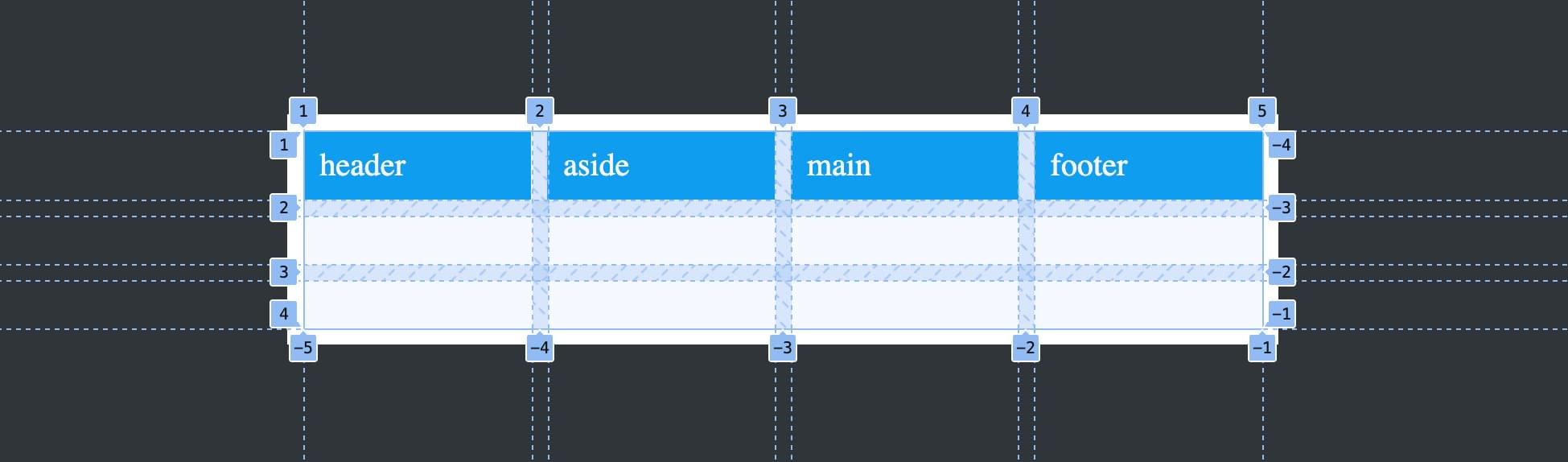
There are five vertical grid lines and four horizontal grid lines, all of them numbered. We can use these grid lines to specify how we want our grid items laid out.
Let's first set the <header> element to span the four columns and one row:
header {
  grid-column: 1 / 5;
  grid-row: 1;
}
This tells the <header> to start at the grid column line numbered 1 and end at the column line numbered 5.It also tells the <header> to start at the first grid row line. Because an end line isn't specified, it just spans to the next row line, so grid-row: 1 is equivalent to grid-row: 1 / 2.
Let's do something similar to the <footer>:
footer {
  grid-column: 1 / 5;
  grid-row: 3 / 4;
}
The only difference here is that we've set the <footer> to sit between grid row lines 3 and 4.
Now let's position the <aside> and <main> elements:
aside {
  grid-column: 1 / 2;
  grid-row: 2 / 3;
}

main {
  grid-column: 2 / 5;
  grid-row: 2 / 3;
}
The result is shown in the Pen below.
See the Pen
CSS Grid Basics: Placing items with numbered lines by SitePoint (@SitePoint)
on CodePen.
We now have a flexible and responsive layout without hacky floats, overflows and other nightmares of the past. If we add content to our grid items, they'll expand to contain that content, and the side-by-side columns will always have equal height. (For those working with CSS in the naughties, achieving equal-height columns was a nightmare!)
Useful things to know about numbered grid lines
If you look again at the image above, you'll see that, along the bottom, the vertical lines are also named with negative numbers. Each grid line has a positive and a negative number. This has lots of uses, such as when there are lots of grid lines and we don't necessarily know how many there will be. We could set our <header> element to span all five columns with grid-column: 1 / -1, as the last vertical line is numbered both 5 and -1.
Grid also has a span keyword, which we can use to tell an element to span a number of rows or columns. Another option for our <header> layout would be to write grid-column: 1 / span 4. This tells the element to start at the first grid line and span across all of our four columns.
Try out these variations in the Pen above.
Further reading:
- Learn more about grid lines.
- The direction in which grid lines are numbered is affected by our layout's writing mode.
- Learn more about grid-column.
- Read about the span keyword in the Grid specification.
The post A Beginner’s Guide to CSS Grid Layout appeared first on SitePoint.