In this article, I’ll show you how to use modern CSS tricks to create fancy CSS ribbon shapes with minimal code. As an extra bonus, our ribbons will have hover animations!
CSS ribbons are everywhere, and you can find a ton of articles about them, but the ones we'll create here are a bit special. We’re going to rely on a single element to create each of the shapes, and CSS variables to easily control them. We aren’t going to rely on fixed dimensions or magic numbers. The shapes will fit their content so you don’t have to worry about the text inside.
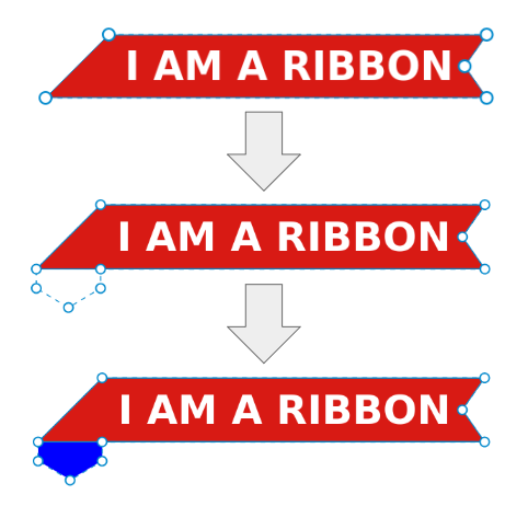
I’ve made a collection of CSS ribbon shapes with a lot of cool examples, and in this article, we’re going to study two types of them, pictured below.
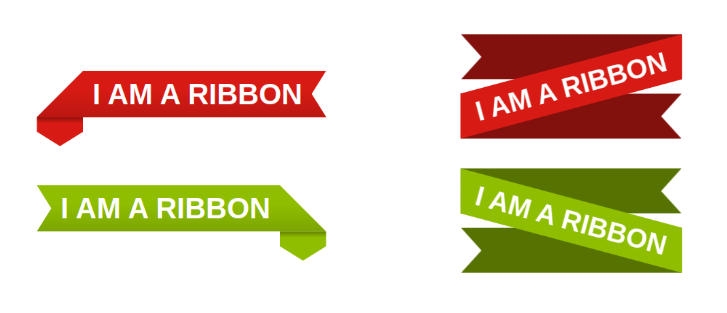
I'll be calling the left one the “folded ribbon” and the right one the “rotated ribbon”.
Creating a CSS Folded Ribbon Shape
The first step in creating our folded CSS ribbon is to define the variables of our shape.
.ribbon {
  --r: 20px; /* control the cutout of the ribbon */
  --s: 20px; /* size of the folded part */
  --c: #d81a14;
}
Two variables will control the shape, and one variable will control the color.
Using clip-path to create a CSS ribbon
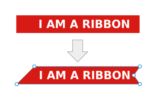
Now let’s move to the code. We're mainly going to rely on clip-path. The image below illustrates the polygon shape we're going to use.
We add some padding to avoid cutting the text, then we apply the clip-path:
.ribbon {
  --r: 20px; /* control the cutout of the ribbon */
  --s: 20px; /* size of the folded part */
  --c: #d81a14;

  line-height: 1.6; /* control the height */
  padding-inline: 1.2lh calc(var(--r) + .2lh);
  background: var(--c);
  clip-path: polygon(1lh 0,100% 0,calc(100% - var(--r)) 50%,100% 100%,100% 100%, 0 100%,0 100%);
}
Using the CSS lh unit
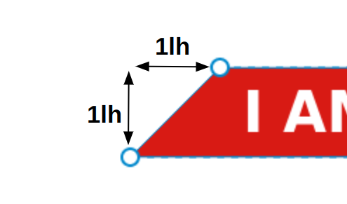
You may be wondering what’s going on with the lh unit. It’s a new unit that corresponds to the line-height value. Since we're using one line of text, the line-height setting is what controls the height, so 1lh is equivalent to the height of the element, which is super useful. (You can read more about the lh unit in An Overview of CSS Sizing Units.)
In clip-path, I need to cut the shape of an isosceles triangle, and to do this I need to know the height of the element. 1lh is equal to that height.
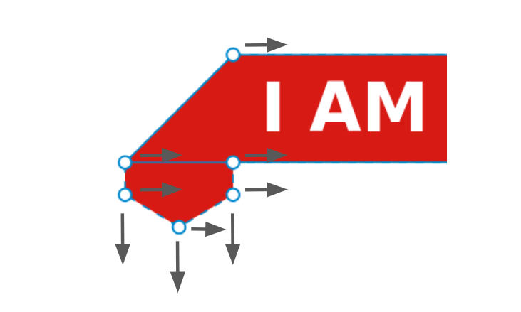
Creating a CSS fold with clip-path
Now, to create the folded part, we're still going to use clip-path and update the previous polygon. The cool thing about clip-path is that it can cut “outside” the boundaries of the element. It may sound surprising or maybe useless, given that we have nothing outside, but it means we can include things like box-shadow, outline, pseudo-elements, and so on.
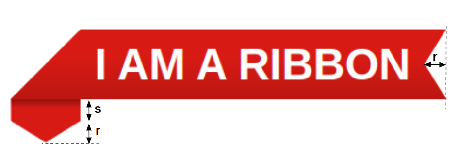
In our case, we'll rely on box-shadow. The image below illustrates the trick.
Note how I'm updating the clip-path to include four new points, three of which are outside the element. Since the part we're cutting is outside, it’s not visible, but if we add a big box-shadow we make if visible. I've used a blue color to illustrate the idea above, but in the code we'll use the same color as the background:
.ribbon {
  --r: 20px; /* control the cutout of the ribbon */
  --s: 20px; /* size of the folded part */
  --c: #d81a14;

  line-height: 1.6; /* control the height */
  padding-inline: 1.2lh calc(var(--r) + .2lh);
  background: var(--c);
  clip-path: polygon(1lh 0,100% 0,calc(100% - var(--r)) 50%,100% 100%,1lh 100%,1lh calc(100% + var(--s)),.5lh calc(100% + var(--s) + var(--r)),0 calc(100% + var(--s)),0 100%);
  box-shadow: 0 0 0 999px var(--c); /* a big spread radius */
}
Finally, we add a touch of shadow effect by introducing a gradient and another box-shadow and we're done. Our CSS ribbon shape is perfect!
See the Pen
CSS-only Ribbon with a nice hover effect by Temani Afif (@t_afif)
on CodePen.
Working with polygons to invert our CSS ribbon
You're probably wondering how to create the second ribbon (the green one). We do the same thing but with a different polygon. We take the first polygon and we invert it.
A polygon can be written like so:
clip-path: polygon(X1 Y1, X2 Y2, ..., Xn Yn)
To get the opposite shape, you change all Xi by 100% - Xi. As simple as that! Before checking my code, try to do it alone using the polygon of the first ribbon.
How to animate our CSS ribbon
In the demo above, hover the shapes to notice a nice animation. To achieve it, we need to update the polygon on hover by offsetting some points. I won’t re-write the whole polygon on hover, but I will define a CSS variable that will control the offset.
If you focus on the animation, you'll notice that we have three points moving to the left and three points moving down and to the left as well.
We update the Xi of the points moving to left with Xi + d and we update the Yi of the points moving doing with Yi + d. Then we simply update the variable d to control the movement:
.ribbon {
  --d: 0px; /* This will control the offset */
  clip-path: polygon(calc(1lh + var(--d)) 0,100% 0,calc(100% - var(--r)) 50%,100% 100%,calc(1lh + var(--d)) 100%,calc(1lh + var(--d)) calc(100% + var(--s) + var(--d)),calc(.5lh + var(--d)) calc(100% + var(--s) + var(--r) + var(--d)),var(--d) calc(100% + var(--s) + var(--d)),var(--d) 100%);
}
.ribbon:hover {
  --d: .2lh;
}
If you see such a polygon for the first time, you may get confused, as it looks a bit scary. But in reality, it’s not that complex. We started with a simple polygon and we slowly added more points and more calculations until we reached this complex one.
The post How to Create CSS Ribbon Shapes with a Single Element appeared first on SitePoint.